Artist Series: We want to know what YOU think!
July 30, 2011 4:51 am
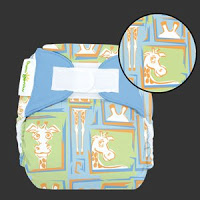
 We have posted an album on the bumGenius Facebook page of the prints we are considering for the next round of the bumGenius Artist Series. These are all prints designed by artists, created independently and submitted to our Marketing department.
About the Author
Heather is mom to four, born within 40 months (single, twins, single). She writes transparently about her chaotic household to encourage others through the twists and turns of parenting.
Comments
10 Comments
Do not like the artist series. They have a sophisticated look that does not draw me in. Would prefer polka dots, stripes, yellow duckies, balloons, polar bears, etc.
I would consider purchasing the bee hive one. The others are cute too, although I don’t care for the giraffe printed one.
I don’t care for these. I understand the concept they are trying to go for is something different than all the pther prints out there, but these seem like a little kid drew on the diapers with a crayon.
I totally agree with anonymous above about BG being a modern company, and these prints feel dated. I also prefer Dwell Studio style to teddy bears and muted colours. I love the bright bold colours you have and think a deep purple, chocolate and even black would be great solid additions to your collection. I do like that these are all very gender neutral, but would prefer to see something similar to Dwell’s ‘Owl’ line. How about a white with solid giraffes in ribbit and twilight or zinnia on it?
not as fan. I would not buy any of them :/ They look cheapey and boyish…I have a girl. I buy gender neutral but don’t find these even that.
I don’t like any of them very much. I like the IDEA of a cute giraffe… but the giraffe diaper you made isn’t cute.
The fish are kinda cute… but also kinda boring. And the rest- too much white. The rocket ships one needs more COLOR…
I won’t be buying any of these. 🙁
Personally, I don’t really care for these prints. (I do LOVE the tiny socialite series though!) I prefer something more modern and sophisticated. These are a little too baby-ish for me. But I do love that you are doing the artist series diapers! And I really appreciate that you are asking your fans/customers for feedback! Thank you!
I’m also a bit disappointed…I personally associate the cottonbabies brands with clean, modern design and fresh colors, and the dated, kiddish (decent concepts, but I don’t like the execution) hand-drawn feel of these with the mustard/seafoam/maroon colors just doesn’t seem to fit at all. Though it’s clear that many people love them (from the FB photo comments)!
My own preference would be midcentury-ish dwell/orla kiley-style graphics (http://kidstylefile.webfactional.com/wp-content/uploads/2009/01/dwell_promojanimage.gif), but I’m sure plenty of people wouldn’t be interested in those either. (And there are other brands that already have similar prints.) Of course, no matter what you do, some people will love and some people won’t…but thanks for pursuing the artist series, your customers DO want prints to go with the great solids. 🙂
ac
I don’t like any of them either. The only one that’s okay is the green one. The rest.. MEH
Honestly, I’m kinda disappointed.It’s been awhile since the artist series started. The Tiny Socialite prints are really cute but they always looked kinda girly to me and I was really hoping to see something just as cute with more appealing for boys. But I’m just not wild about these prints. The beehives look like poop. I the rockets are a bit too phallic. There is nothing compelling about any of the other prints.If they were fabrics in a store I’d walk right by them. Sorry 🙁